Identity + Packaging

Company Description
Violet Swarm is a chain store that sells beauty products. Their main product stands out because of its reputation and authenticity. With a target audience of young adults, they want to convey a sense of bravery, while at the same time being gentle.
Design Brief
Create packaging for the company’s main product. The product should be shown prominently and include a description. An extravagant design is preferred as well as the use of the brand’s color which is purple.
Goals
Create a brand identity that encompasses the company details given in the brief. Build a unique product that fits within the identity to be its main seller. Design the packaging for the product along with visuals to enhance the design concept.
Tasks
Logo Design, Packaging Design, 3D Modeling, Animation
Project Type
Conceptual
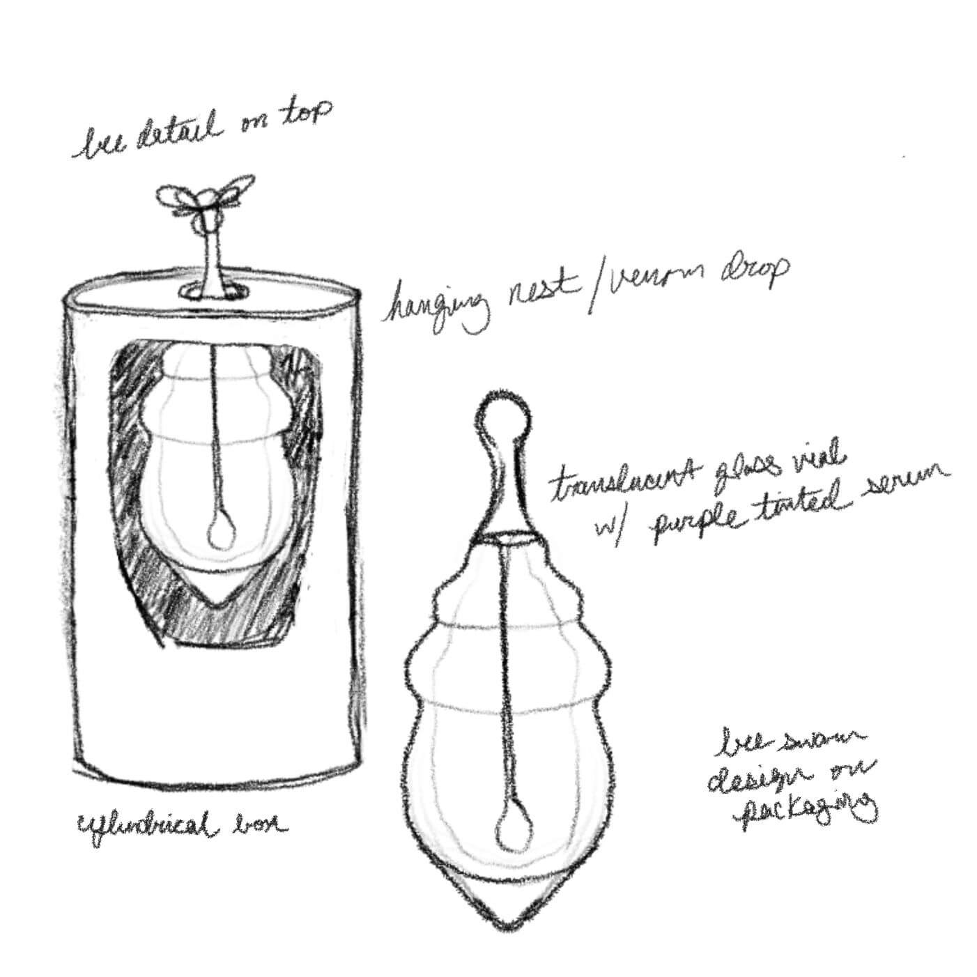
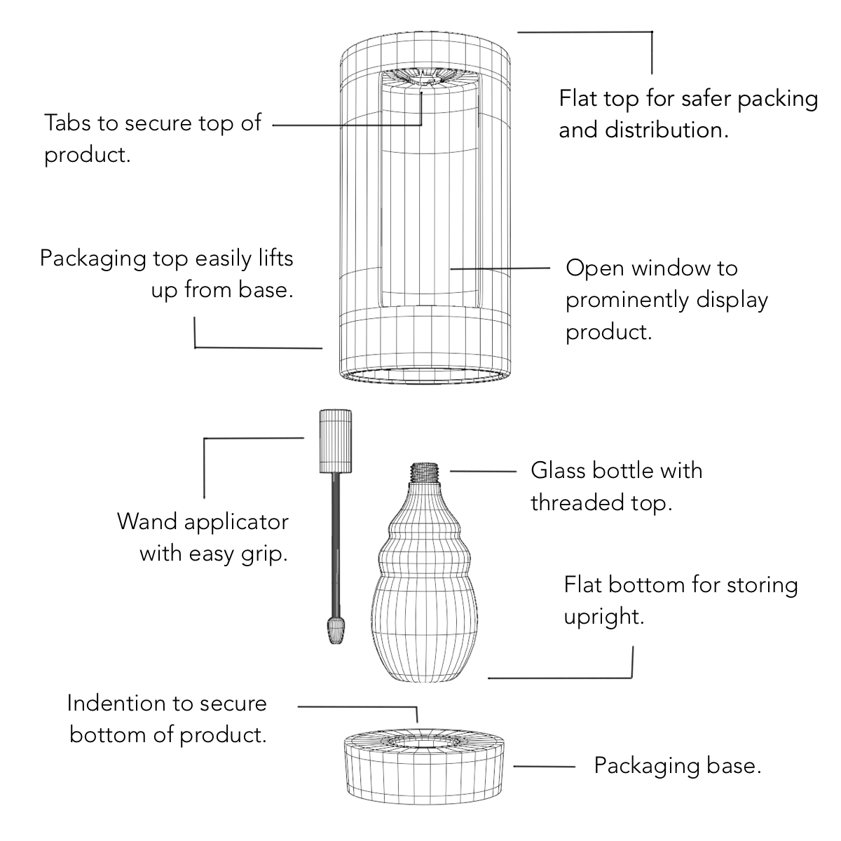
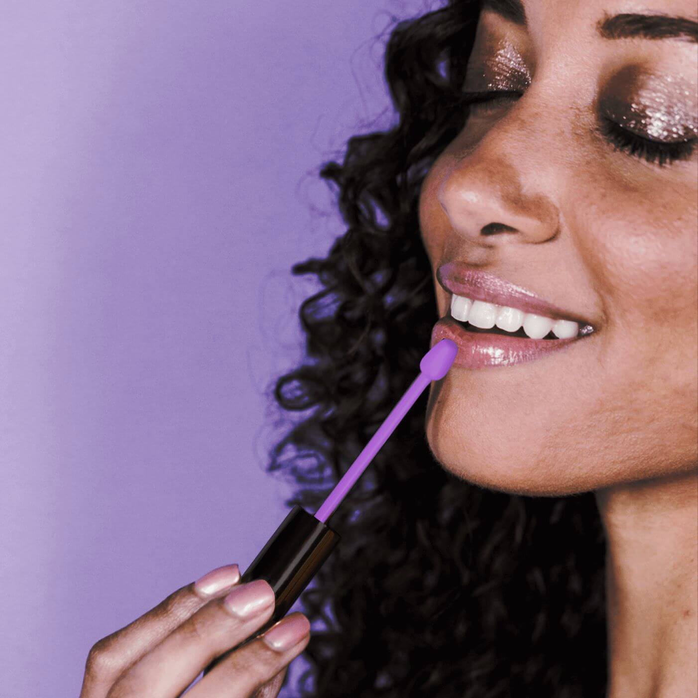
Before I could begin designing the product packaging I had to first decide what the product would be. I began with the company name, Violet Swarm. My mind went in the obvious direction of bees as I imagined an aggressive swarm that would definitely result in a sting or two… bee venom! A natural ingredient known for its anti-aging and plumping properties. And so the main product was born, a lip-plumping serum made from bee venom plus the antibacterial and gentle healing properties of honey.
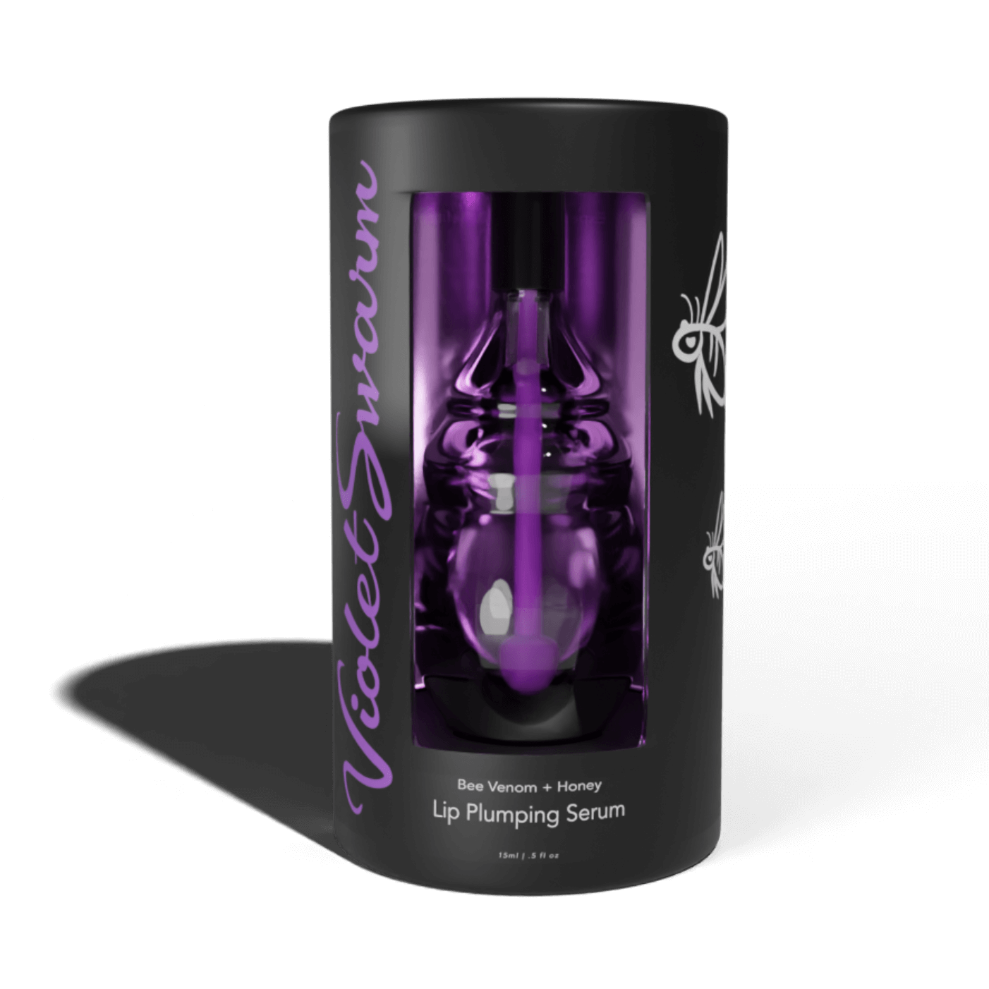
I began sketching ideas for the packaging. The brief stated something extravagant so I knew I wanted it to be unique. I went with a beehive shape but clear with purple tinted serum. I thought this gave the illusion of a drop of venom. Nestled in a cylindrical package with an open front to display the product. A few changes were made to my original sketch as I thought through the packing, logistics, and store display of the product. It needed to be secure and stackable with no extruding parts that could be damaged.


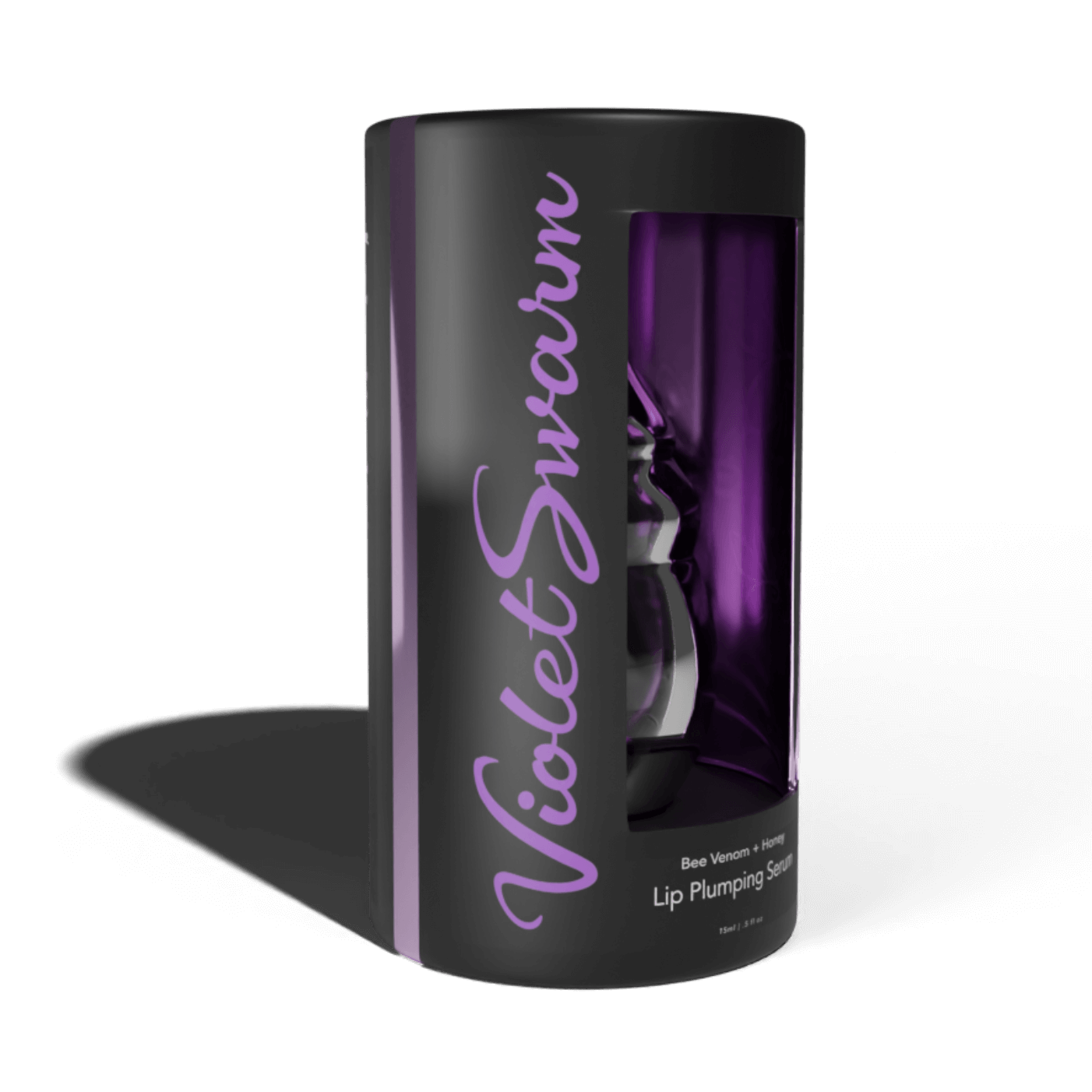
Once the modeling of the product was complete it was time to start designing the package. First things first, I needed a logo. I wanted it to be feminine and fun as well as something that would appeal to young adults. I went with a cursive font, that resembled the flying path of a bee but also had bold and intentional lines. The V that resembles a bee stinger and the S were hand drawn to create better balance and aesthetic within the logo.
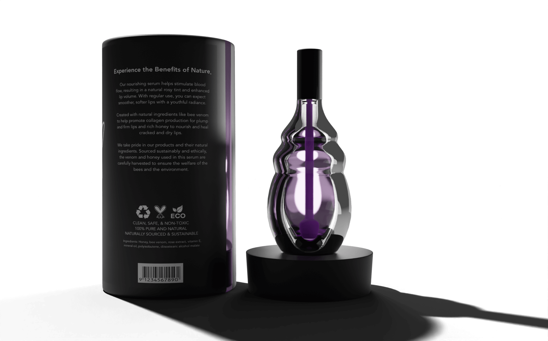
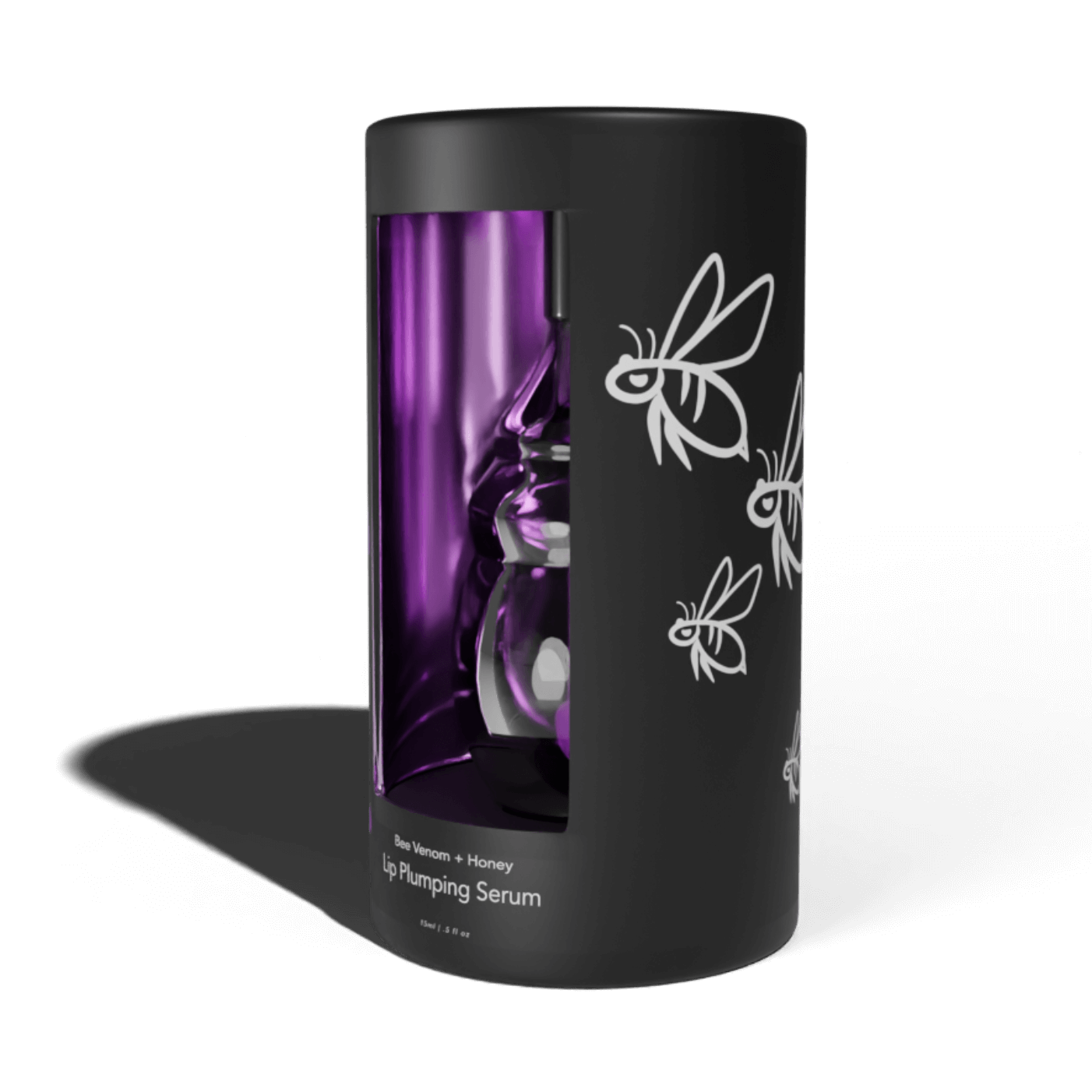
Because the product vial itself was designed as a bee hive I wanted to have a bee element in my package design. The right side has been decorated with a hand drawn swarm circling the hive. The product name is printed clearly just below the window and a product description, ingredients, packaging labels, and bar code are located on the backside of the package. The inner package shines with a metallic purple to draw your eye to the product.
